


No products in the cart.
August 8, 2026
When asked about the most important colours in the history of art, the same names almost always come up: ultramarine, carmine red, ochre, or perhaps Van Gogh's brilliant yellow. Hardly anyone thinks of white.
Without white, however, much of the painting we know today would be almost unimaginable. It allows colours to breathe, softens contrasts, gives form its shape, and often changes the character of a colour mixture more profoundly than any other paint on the palette. Yet, paradoxically, white remains one of art's most overlooked colours.
As the lightest of all colours, white plays a crucial role in the depiction of light. Light is one of the most powerful compositional tools in painting. It directs the viewer's eye, creates atmosphere, and gives a painting depth. For good reason, it is often central to the interpretation of a work of art. Yet white itself rarely attracts much attention. It is neither emptiness nor merely a background. White not only affects brightness but also changes the character of every other colour – and, in doing so, shapes the light within the painting itself.
White space is not unused space. It creates a sense of calm and prevents a painting or design from feeling overcrowded. Precisely because not every area is filled, it leaves room for what truly matters – and for the viewer's own imagination.
This principle shapes not only my paintings but also the design of my website. I deliberately work with generous areas of white space. To me, it brings a sense of calm to the overall composition while creating tension in the details. It guides the viewer's eye without forcing it.
What first appears to be empty is often the very part of a composition that allows everything else to have its full impact. By inviting viewers to complete the image in their own minds, white space encourages a deeper and more personal engagement with the work.
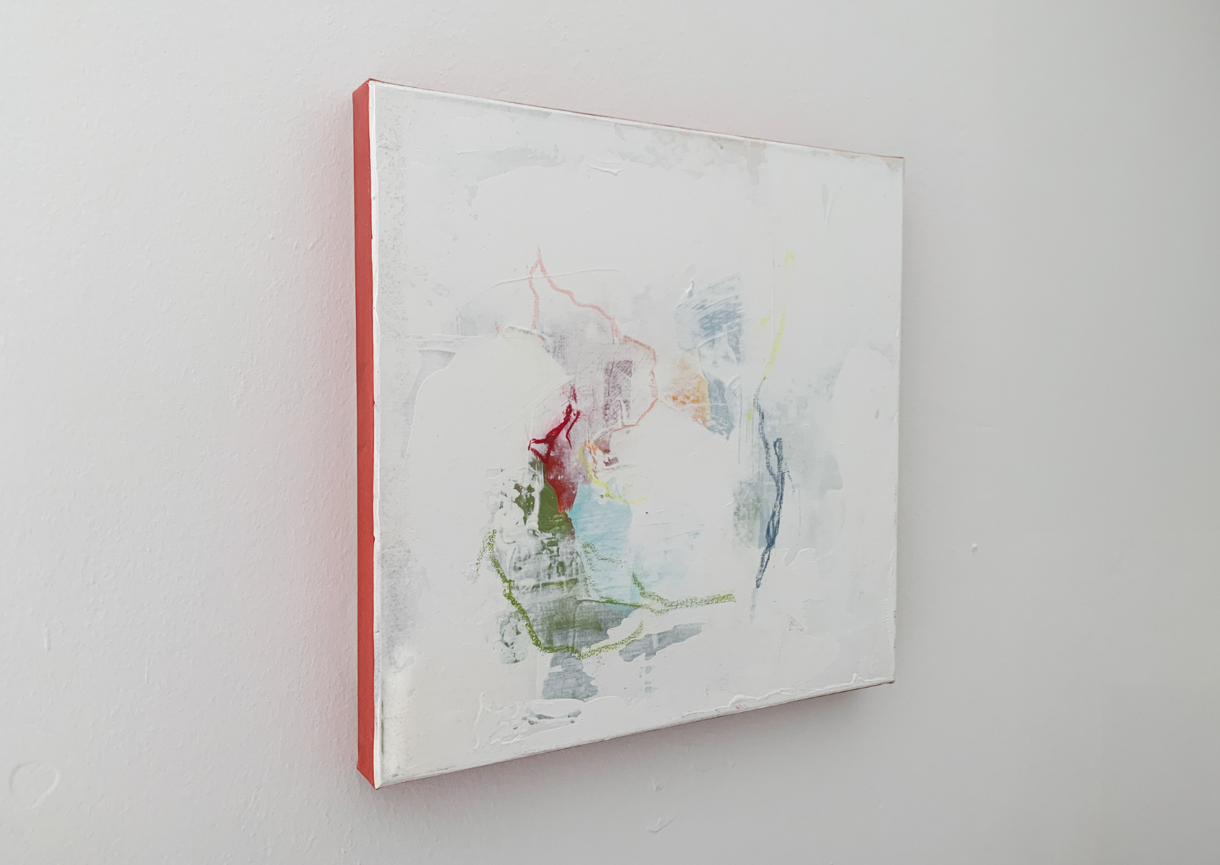
To me, white space is never empty; it is an integral part of the composition. Glimpse of a Lazy Day by the Lakeside by Lea Finke
Our brains never perceive elements in isolation, but always in relation to their surroundings. Our eyes instinctively search for orientation, contrast, and focal points. A single red dot on a white surface immediately draws our attention. Place that same dot in a densely filled composition, and it is far more likely to go unnoticed. This is one of the roles of white space: it separates, connects, and organises without demanding attention itself.
Many works reveal the artist's urge to fill every empty area. And sometimes, a composition genuinely calls for that. More often, however, a strong composition emerges precisely because something has been left out. Less is more. White space requires restraint. It means trusting the image.
Leaving areas deliberately unpainted is by no means a modern design concept. In East Asian ink painting, the untouched paper may represent light, mist, water, or simply the space between things.
The same principle extends beyond painting. In typography, white space makes text easier to read. In architecture, open spaces give buildings presence. And in music, tension and rhythm often arise not only from the notes themselves but also from the pauses between them.
Anyone who has ever tried to paint a room has probably discovered that choosing a shade of white is surprisingly complicated. Brilliant white, ivory, cream, off-white, warm white or cool white – suddenly there are countless variations of a colour that, at first glance, hardly seems to vary at all.
Painting is no different. There is no single white here either. Some whites appear warm and soft, others cool and crisp. A subtly muted white can feel calmer than a brilliant titanium white. Often, the difference only becomes apparent when it is placed alongside other colours.
But white differs not only in how it looks. The various shades are also based on fundamentally different pigments. In painting, three white pigments are particularly important.
For centuries, lead white was the most important white pigment in European painting. Artists valued it for its warm tone and its exceptional handling properties.
As early as antiquity, and certainly by the Middle Ages, it was known that people who worked with lead could become seriously ill. There were reports of colic, paralysis, and other health problems. Yet lead white remained the dominant white pigment in European painting for centuries because there was simply no equally effective alternative. Other white pigments, such as chalk, gypsum, and bone ash, lacked both opacity and strength.
Today, lead white is rarely used in artists' materials and has largely been replaced by safer alternatives.
Zinc white became commercially available in the 19th century. It was non-toxic, less opaque than lead white, and behaved differently as it dried. Pure layers of zinc white can also become brittle over time, increasing the risk of cracking in some paintings. For these reasons, many artists were initially reluctant to embrace it.
Its transparency, however, makes it particularly well suited to subtle transitions and delicate glazes.
By the mid-20th century, titanium white had become the standard white in artists' paints. Today, it is the most widely used white pigment. It is highly opaque, lightfast, and generally considered non-toxic. It brightens colours very quickly, making it ideal for creating strong contrasts. At the same time, however, it can cause colour mixtures to lose their luminosity more readily.
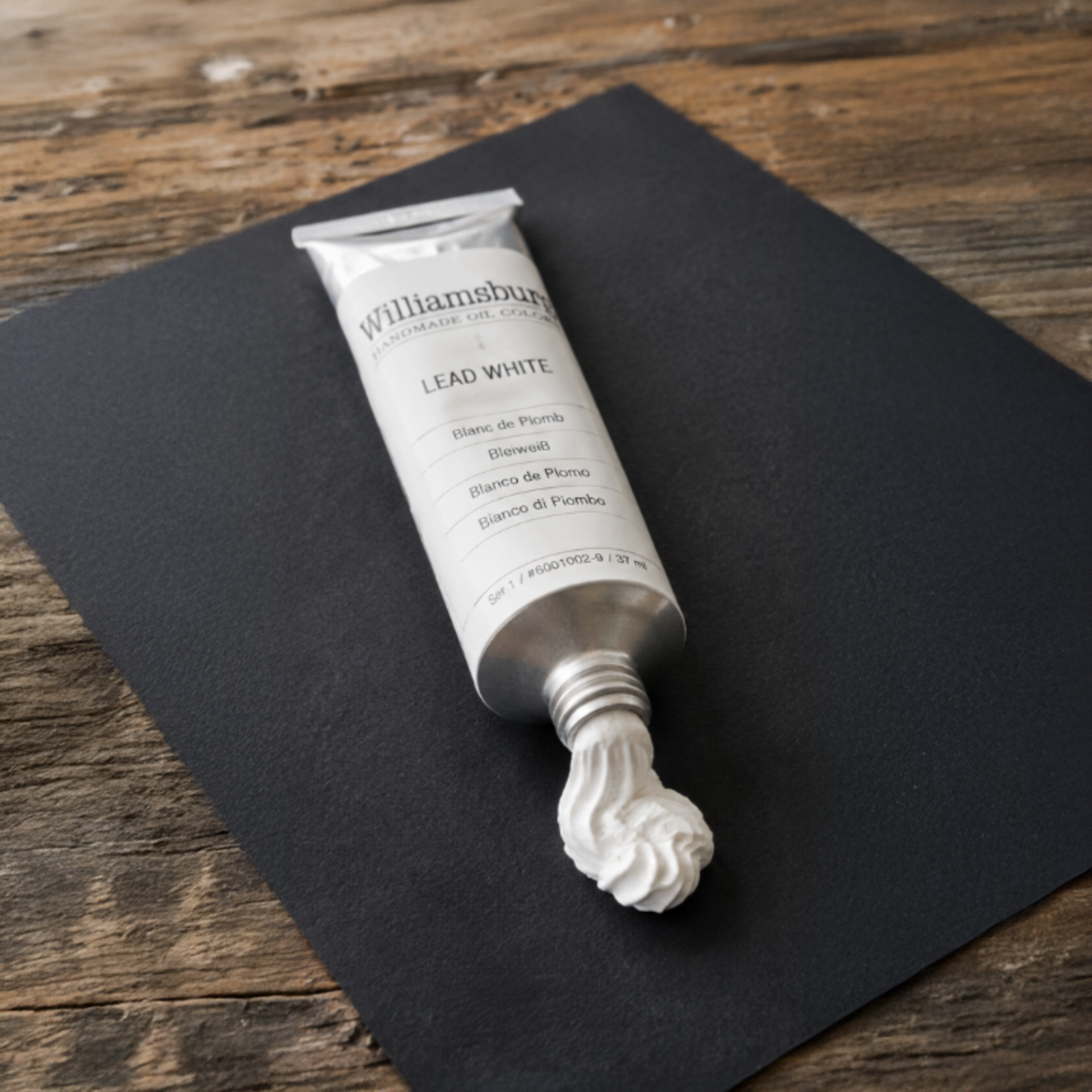
warm
semi-opaque
the standard white for centuries
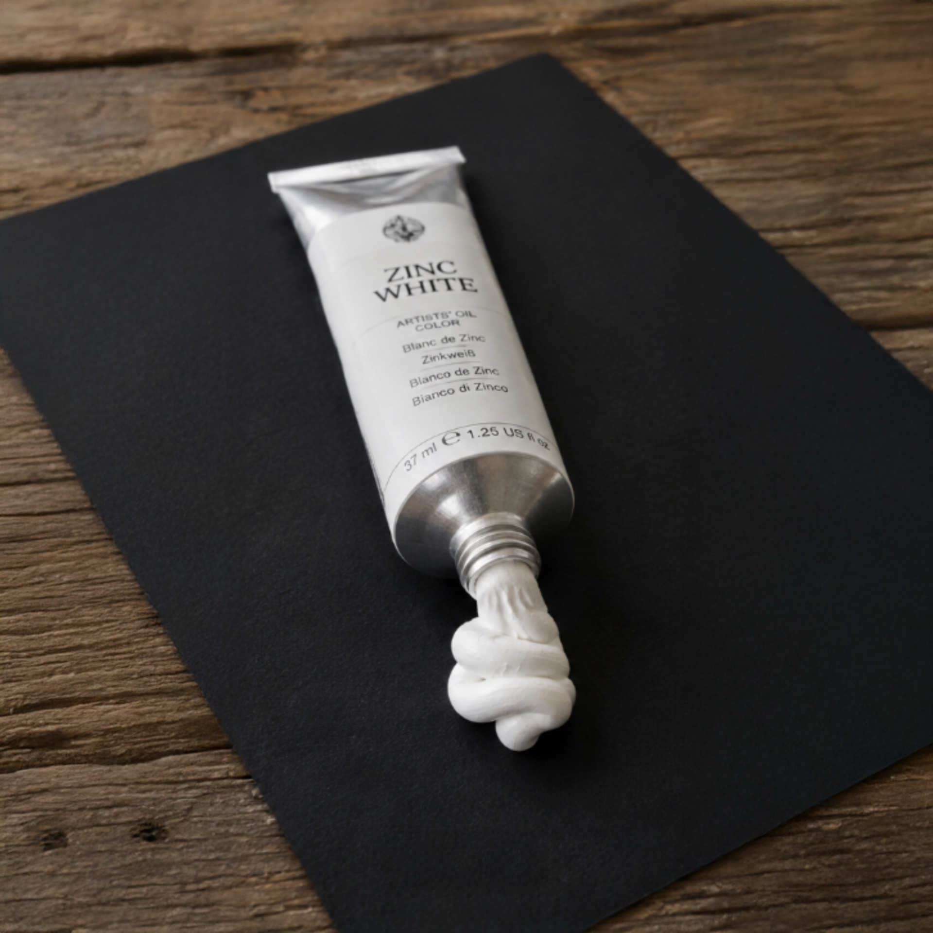
cool
transparent
ideal for subtle transitions
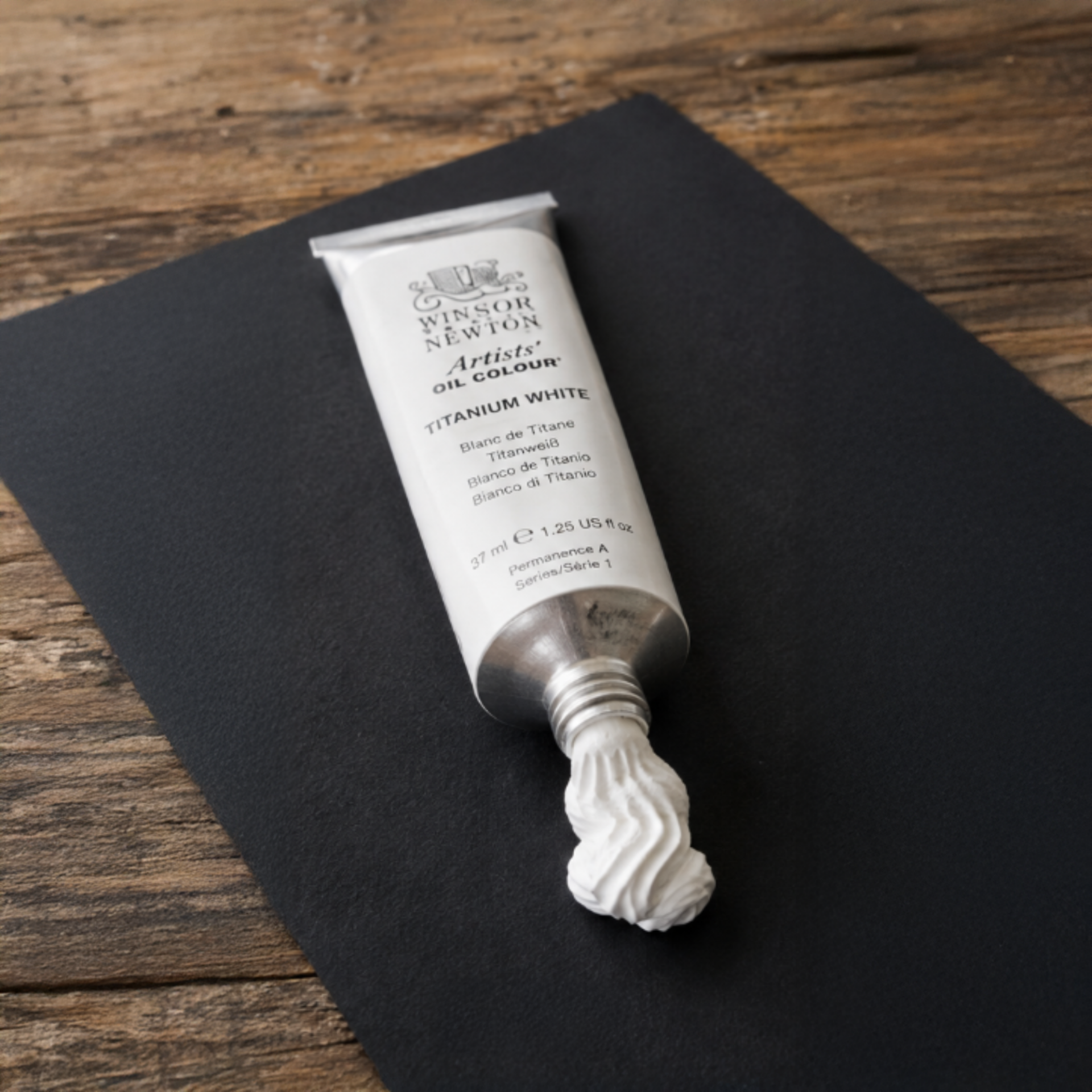
neutral too cool
highly opaque
the standard white used today
AI-generated depiction of lead white, zinc white, and titanium white.
Today, titanium white and zinc white are the only white pigments commonly found in professional artists' paints. Lead white is produced by only a handful of manufacturers for specialist applications and is subject to strict regulations.
Alongside these, there are various mixed whites, created by combining titanium white and zinc white or by adding tiny amounts of other pigments. Some artists also keep Buff Titanium on their palette. Made from a naturally occurring titanium mineral, it produces a warm, beige-toned white that is particularly well suited to landscapes and skin tones.
More generally, artists often temper white with a touch of ochre, grey, blue, or another colour. The result appears more natural and allows light to feel more convincing. Pure white is therefore often reserved for the brightest highlights.
Incidentally, the white pigment used in a painting can also provide valuable clues about when it was created. Art historians, conservators, and authentication experts can often estimate a painting's age from its pigments. If titanium white appears in a work supposedly painted in the 18th century, it is a strong reason to look more closely.
The significance of white becomes most apparent where artists either place it deliberately at the centre of their work or use it so subtly that it almost goes unnoticed.
Sometimes white appears as nothing more than a tiny highlight, adding a touch of brilliance to an object. At other times, it spreads across an entire painting as mist, snow, or light itself. It can define form, dissolve contours, make colours appear warmer or cooler, or even become the subject of a work of art in its own right.
In painting, light is rarely simply white. More often, the impression of luminosity arises from the interplay of light and shadow, transparent layers of paint, and carefully placed highlights.
As early as the 15th century, Jan van Eyck mastered these techniques with remarkable skill. His paintings often appear to glow from within, despite containing very few areas of pure white. This luminous quality is particularly evident in works such as The Virgin of Chancellor Rolin and the Ghent Altarpiece, whose colours still possess extraordinary depth and brilliance today.
Much of this effect stems from van Eyck's painting technique. He began with a light-coloured ground, often white or pale grey, followed by a monochrome or only lightly coloured underpainting. Over this, he applied numerous thin, transparent glazes. Light could pass through these layers, reflect off the pale ground beneath, and emerge tinted with colour. The result was an exceptional sense of depth and luminosity.
The brightest passages in his paintings are often those where the glazes are thinnest—or absent altogether—allowing the pale ground or the underlying lead white to shine through most strongly.
Johannes Vermeer, by contrast, created his brightest highlights by deliberately applying opaque lead white. These final highlights were often added at the very end of the painting process. In works such as Girl with a Pearl Earring and The Milkmaid, he frequently reserved pure white for tiny points of light: the gleam of a pearl, the reflection on a metal jug, or daylight falling across fabric and walls.
Precisely because these highlights are used so sparingly, they draw the viewer's eye almost irresistibly.
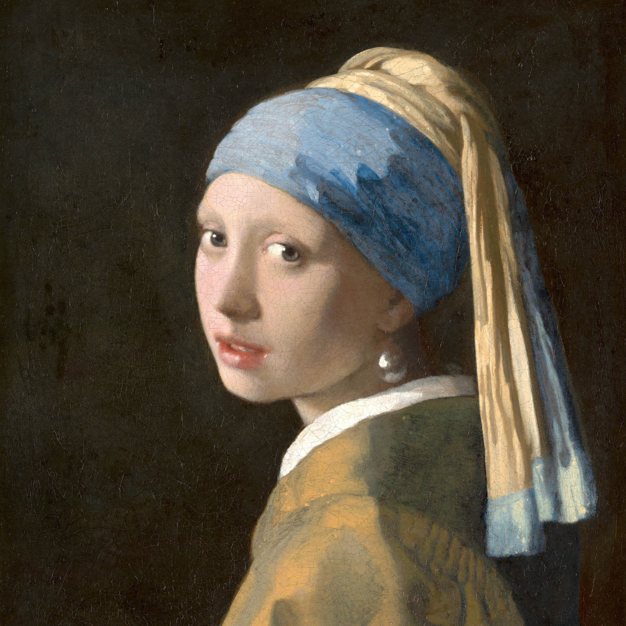
Girl with a Pearl Earring, Johannes Vermeer, Mauritshuis, Den Haag
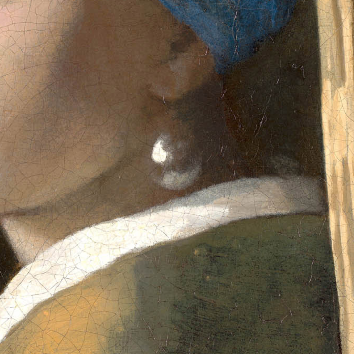
Detail – The pearl itself is not actually white. It is painted primarily in shades of grey with subtle warm tones.
Finally, in the work of J. M. W. Turner, white seems almost to lose its physical presence. Mist, sea spray, clouds, and sunlight merge into one another, dissolving solid forms. White no longer merely depicts light – it becomes atmosphere itself. In paintings such as Snow Storm – Steam-Boat off a Harbour's Mouth and The Fighting Temeraire, light no longer appears to fall upon objects but seems to fill the entire pictorial space.
Turner mixed white generously into his colours, creating the luminous, airy palette that characterises his later works. He often worked wet into wet, allowing him to lift paint with a cloth, sponge, or dry brush while it was still wet, or to scratch delicate lines into the surface using the handle of his brush. These techniques produced fine streaks of light, suggesting details such as masts, waves, and shimmering reflections.
As we have seen, white is not only a colour in its own right; other colours can also be used to create the impression of white. The Impressionists were fascinated by the question of how light shapes our perception. Artists such as Claude Monet explored the constant changes in colour throughout the day. Objects, they realised, did not possess one fixed, "correct" colour. Their appearance shifted with the changing light, whether bathed in sunshine or lying in shadow.
The same was true of white. To Claude Monet, snow was never simply white. It became a canvas for light itself. In The Magpie (La Pie), the snow-covered landscape appears almost white at first glance. Look more closely, however, and it reveals delicate blues, violets, golden hues, and soft pinks.
Joaquín Sorolla explored the same idea beneath the dazzling Mediterranean sun. In Sewing the Sail, the large sail initially appears brilliantly white. In reality, it is composed of countless warm and cool tones. Here too, white is not the colour of the fabric itself, but the result of the light falling upon it.
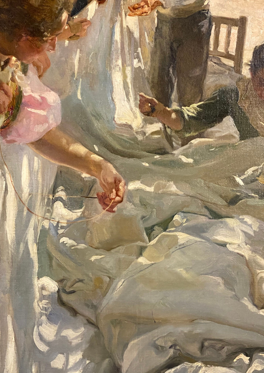
Detail: Sewing the Sail, Joaquín Sorolla
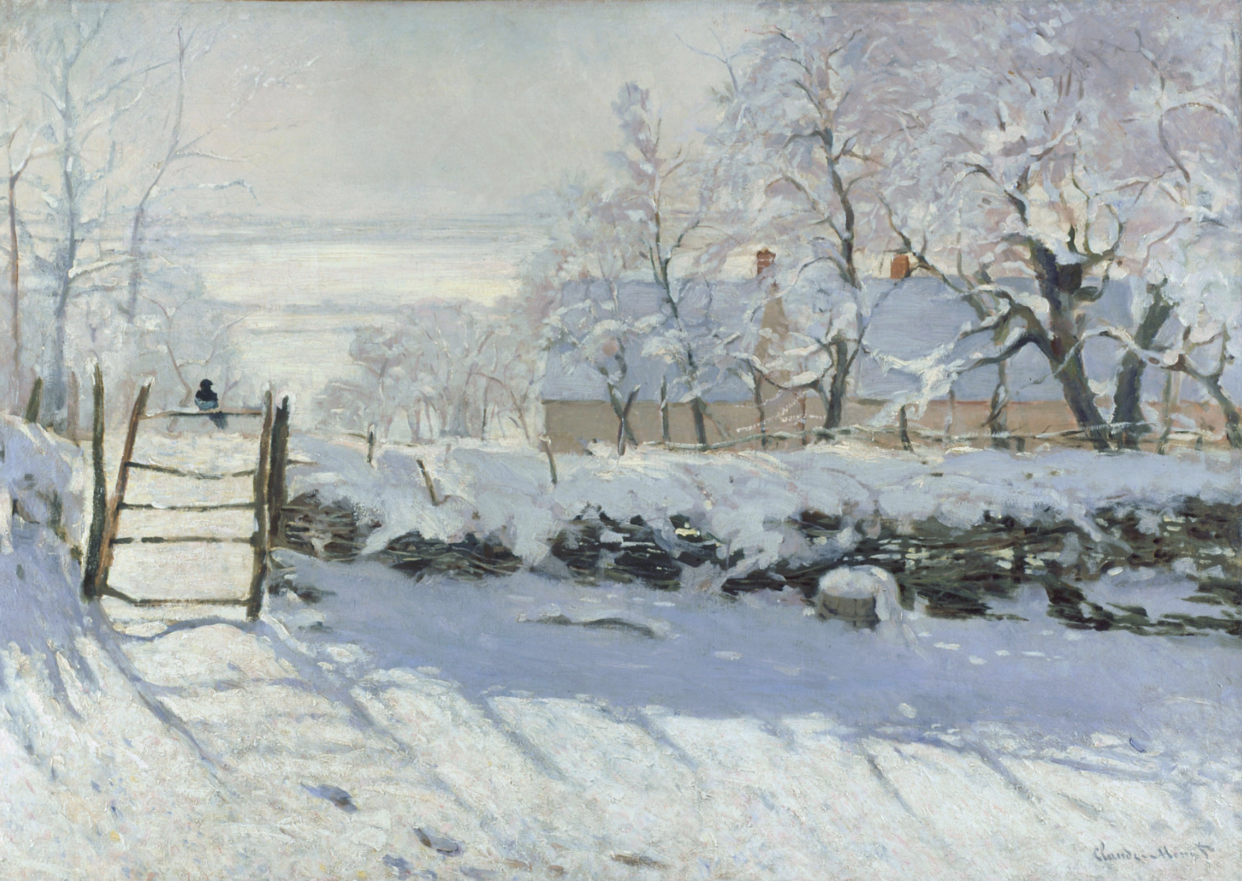
The Magpie, Claude Monet
In the 20th century, white became a subject in its own right.
In 1918, Kazimir Malevich created White on White, a painting of a slightly tilted white square set against a subtly different white background. What appears deceptively simple today was revolutionary at the time. Malevich abandoned almost all references to objects, perspective, and narrative. Instead, he asked whether a painting could exist through nothing more than colour, form, and the subtle relationships between them.
Speaking of White on White: in Yasmina Reza's play Art, the central work is a painting by the fictional artist Antrios—a white canvas with delicate white diagonal lines. It becomes the catalyst for a heated argument about art and taste, bringing a long-standing friendship to the brink of collapse.
The American artist Robert Ryman took the idea even further. He began creating his characteristic white paintings in the late 1950s and remained committed to them throughout his career. Yet he never considered himself a painter of "white paintings". He repeatedly explained that his real interest lay not in the colour white, but in painting itself.
For Ryman, white became the ideal means of making everything else visible: the brushstroke, the surface, the opacity of the paint, the support, the way light interacts with the work, and even the method by which the painting is attached to the wall.
He deliberately avoided strong colours that might distract the viewer. Instead, he used white as a form of reduction. He experimented with different white pigments, brushes, paint application, and supports. Sometimes the surface appears matte, sometimes glossy, smooth or richly textured. As the viewer moves, the changing light continually alters the way the painting is perceived.
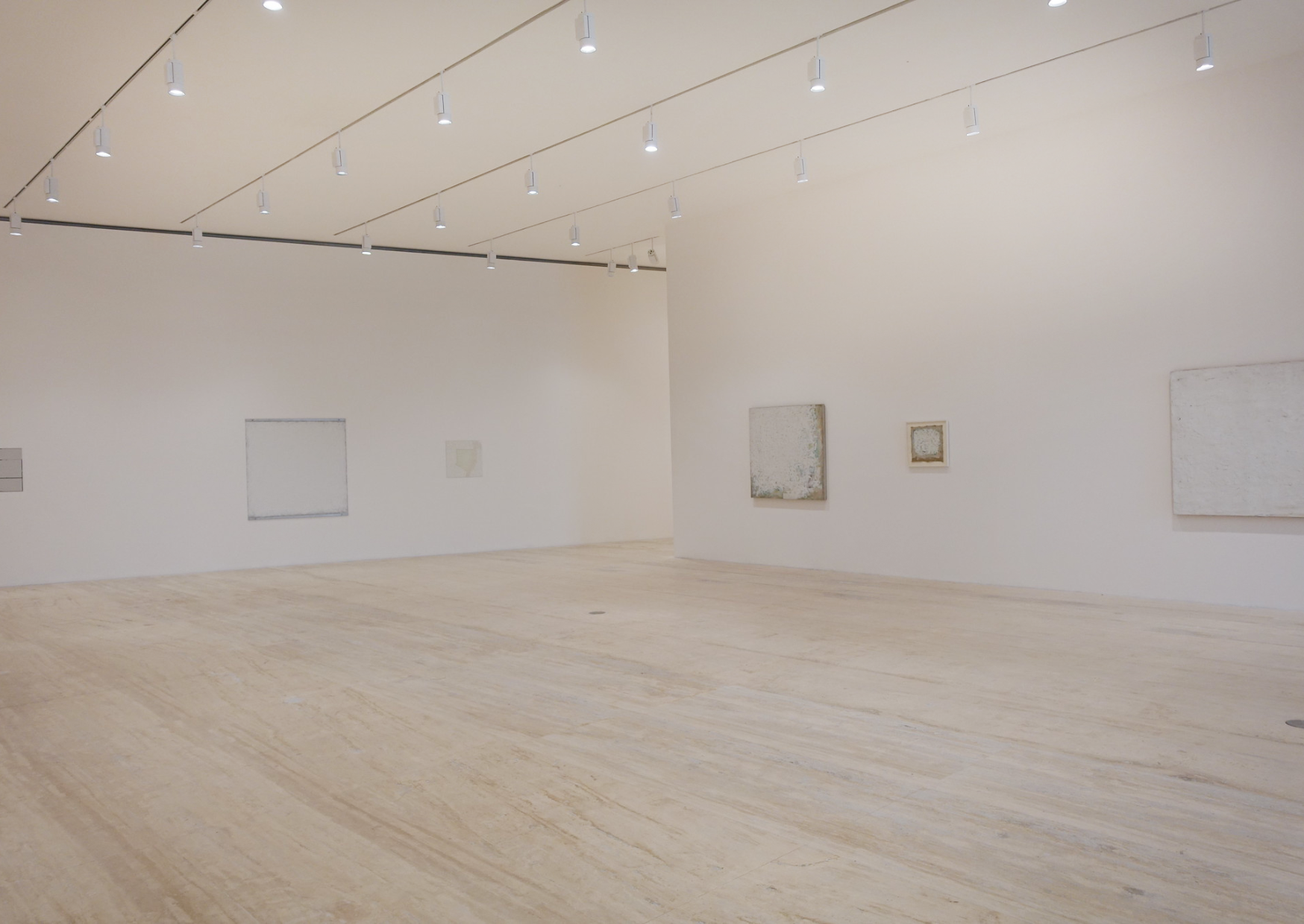
Robert Ryman, Museo Jumex
For me—and for many artists I know—white is the colour we buy in the largest tubes, yet somehow it is always the first to run out. And yet, in a finished painting, it is often the last colour we truly notice.
White never demands attention. Instead, it allows other colours to shine, creates space, and quietly guides our eye towards what matters most.
Join the newsletter now
and not miss a thing
Get exclusive insights into my creative processes, learn the stories behind my artwork
and receive invitations to my exhibitions and events.
To say thank you, I'll give you 10% off your first purchase.