No products in the cart.
November 14, 2025
In art history, the colour blue appeared surprisingly late. For a long time, people painted with whatever they had available, using earth pigments such as ochre, red, brown and black. A natural, durable blue simply did not occur in the environment. That is why it is not found in Stone Age cave paintings.
It was not until around 2500 BC that one of the world's first artificially produced pigments was created – known as Egyptian blue. It shone in a clear sky blue tone and was used on wall reliefs and statues. In the tomb paintings of Thebes, for example. In the tomb of Nebamun (around 1350 BC), it was used to depict water, the sky and details in clothing. The crown on the bust of Nefertiti, which can now be seen in the Egyptian Museum in Berlin, was also coloured with this pigment.
Egyptian blue also found its way to other regions of the Mediterranean, via Mesopotamia, for example, to Greece and Rome. However, the collapse of the Western Roman Empire in the 5th century had a profound impact on art.
For a long time, blue largely disappeared from painting.
In the early Middle Ages in Europe, roughly between the 5th and 11th centuries, artists' palettes were significantly limited. Many pigments that were common in ancient times were lost with the Roman Empire because the knowledge of how to produce them disappeared or trade routes were interrupted. This included Egyptian blue.
Theoretically, there were some blue pigments available, such as azurite, a naturally occurring copper mineral, or indigo, a dye of plant origin. And they were also used, as in Irish book illumination (for example, in the Book of Kells). However, azurite was sensitive to moisture and alkalis, i.e. to the lime in frescoes, and could therefore discolour over time, from bright blue to greenish or brownish.
The only bright blue that has survived from this period can be found in Byzantine art. In the large church mosaics of Constantinople, Ravenna and Thessaloniki, the blue areas still shine today because they are made of coloured glass.
Lapis lazuli, a semi-precious stone, still comes almost exclusively from a single region: present-day Afghanistan, more precisely from the mines of Badakhshan in the north-east of the country, which have been in operation for over 6,000 years. From there, lapis lazuli travelled along long trade routes – through Persia, Mesopotamia, and Egypt – to the Mediterranean region. Even in ancient times, it was considered a symbol of the divine. The Sumerians, Egyptians and later also the Greeks used it for amulets, jewellery and artistic inlays.
After the collapse of the Roman Empire, lapis lazuli was virtually unavailable in Europe for many centuries. It was only with the flourishing of medieval trade with the Orient, mainly through the Crusades, Venetian trade networks and contact with Islamic cultures, that the material returned to the West. At the same time, a new understanding of colour and material began to develop around 1200–1300.
It was the era of Gothic cathedrals, rich manuscripts and fresco painting in Italy, and everywhere, bright colours played an aesthetic and theological role.
The knowledge of how to extract colours from stones was fundamentally available – pigments had been produced from minerals since ancient times. But lapis lazuli presented a particular challenge.
Simply grinding it produced a grey-blue powder because light-coloured rock particles and pure lazurite were mixed together. But only the fine lazurite grain contains the intense colour. So it had to be separated from the rest of the rock somehow.

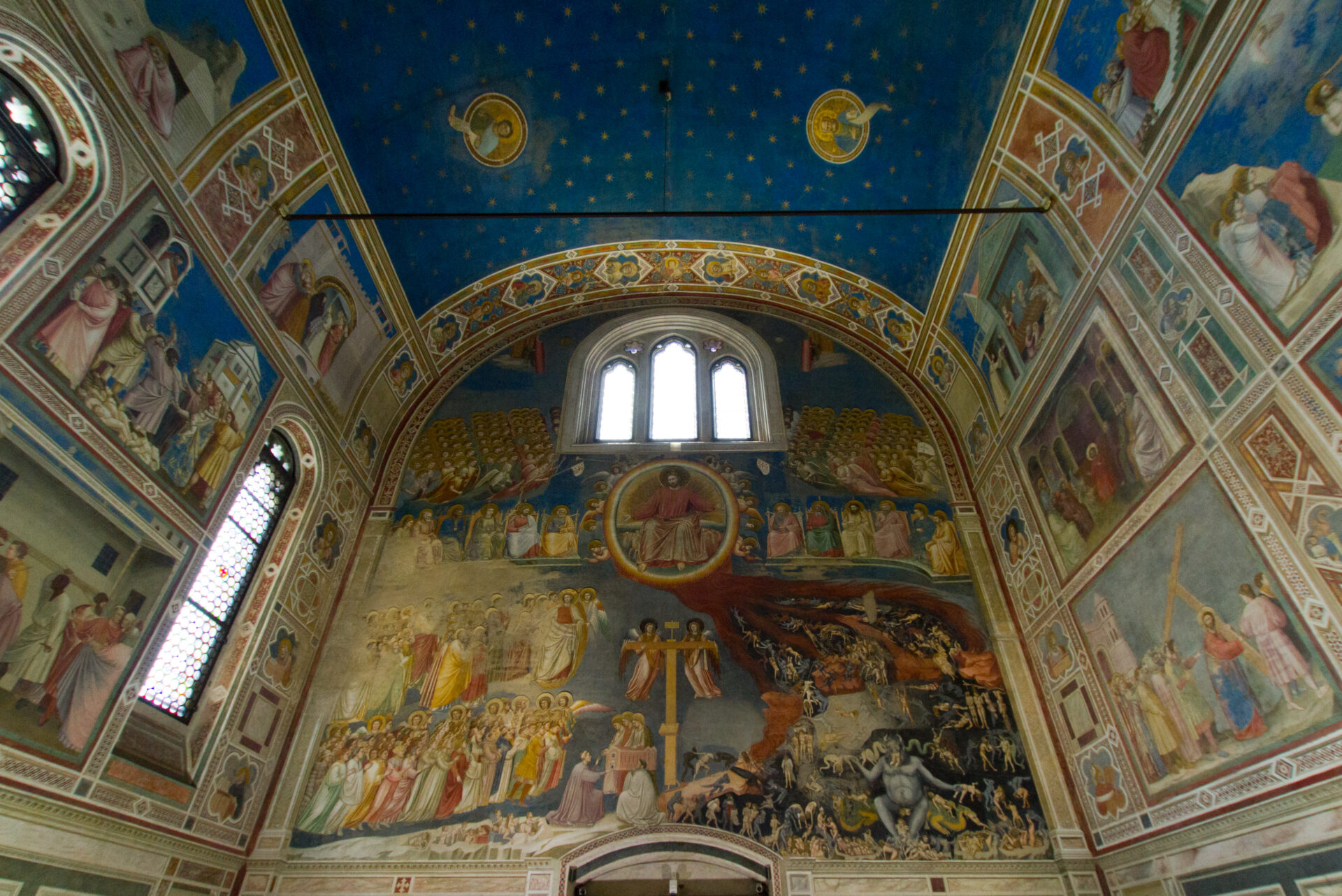
Giotto di Bondone, Cappella degli Scrovegni , Padua
When and where exactly someone came up with the idea of treating the ground substance with wax, resin and lye is not documented. Presumably in northern Italy, probably in the 13th century, but no one knows for sure.
In any case, the oldest written description can be found in Cennino Cennini's Libro dell'Arte (around 1400).
The result of this process was ultramarine, the purest and most vibrant blue known to painting – and also the most expensive pigment of all.
Its name is derived from the Latin ultra marinum – “beyond the sea” – a reference to its distant origin. In European painting of the 14th and 15th centuries, ultramarine was so precious that it was usually charged separately from the rest of the work. Clients specified in the contract which parts were to be painted with it.
Ultramarine did not fade in air or light. It could be mixed well with other pigments without reacting and had a special optical depth. A velvety, transparent glow that was unique in frescoes and tempera.
Because it was more expensive than gold, it was often used only for the central, most sacred or most valuable parts of a painting – such as the Virgin Mary's cloak or the sky in scenes with Christ.
This led to blue becoming the sacred colour par excellence.

Jan van Eyck, Madonna of Chancellor Rolin, Louvre, Paris
In early cultures, blue was not a symbolically charged colour. Red, black, white and yellow dominated as carriers of fixed meanings. Red stood for life or power, black for death or fertility, white for purity. Since blue hardly ever occurred in nature in a stable form, it played only a marginal role in painting.
Many ancient languages, including Ancient Greek and Hebrew, did not even have a separate word for blue. In Greek, blue and dark shades were often subsumed under ‘kyaneos’ (dark, shiny) or ‘glaukos’ (greenish, shimmering).
In the Odyssey, Homer describes the sea as ‘wine-coloured’ (‘oinops pontos’) – i.e. shimmering reddish-brown, not blue. This has less to do with colour blindness than with a different understanding of colour. Ancient cultures classified colours according to brightness and material effect, rather than wavelength or hue. It was not until the Middle Ages and early modern times that a clear awareness of colour as a separate category emerged, with corresponding terms in European languages.
In the early advanced civilisations, i.e. in Egypt, Mesopotamia, and the Aegean world, art was not representational in the modern sense, but symbolic and functional. Landscapes were not depicted, but rather gods, rulers, rituals, symbols of power or the afterlife. The sky was not a motif, but a place that could be symbolically represented by gold or black.
Blue was therefore not a necessary ‘natural pigment’ because the sky, water or air were not understood as subjects, but as contextual surfaces that served a symbolic order. Landscape painting, in which one really had to paint the sky, simply did not exist. The idea that painting could create an illusion of space or nature did not arise until much later.
The production of Egyptian blue around 2500 BC was therefore more of a technical achievement than the result of a deliberate search for a ‘meaningful’ colour. The effort required to obtain it made it something special. And through its connection with the sky and water, blue gradually took on a spiritual dimension. In Egypt, it stood for the divine, the eternal, for protection and rebirth. These were qualities associated with the sky and the Nile.
In the 1st century BC and AD, artists began to depict depth, atmosphere, and sky tones. In the wall paintings of Pompeii and Herculaneum, blue actually appears as a room colour – mostly in the form of Egyptian blue or azurite, often mixed with white to achieve light effects.
However, after the collapse of the Roman Empire in the West, this type of representation also disappeared. In medieval art, the landscape once again had no significance. The pictorial space became flat, symbolic, divine. There was no need for pigment for the sky or horizon because this sky did not exist in a perspectival sense.
When lapis lazuli was used in European painting, it was initially primarily a symbol of prestige. The pigment was extremely expensive; those who could afford it demonstrated both wealth and piety. The blue stood for the sky, for purity. But it was not religious symbolism that led to the use of blue; rather, the rarity and preciousness of the material contributed to its becoming sacred.
From the 16th century onwards, as maritime trade expanded, indigo arrived in Europe in large quantities and also found its way into the workshops of local painters, initially as an additive for colouring glazes and inks.
It was not well suited for paste applications, but it mixed excellently with water or glue and produced a soft, hazy blue that remained transparent in thin layers. This is why indigo gradually found its way into watercolour painting.
However, it took another two centuries before watercolours became an art medium in their own right; initially, they were mainly used for sketches, maps, and illustrations. But long before that, a new blue appeared in the art world. How much of this story actually corresponds to the facts can no longer be said with certainty today. In any case, the legend goes like this:
In 1706, the colour maker Heinrich Diesbach wanted to produce a red pigment in his Berlin workshop. But he ran out of the potash he needed. The theologian, alchemist, physician, and naturalist Johann Conrad Dippel lived in the neighbourhood. Dippel was eccentric, searching for the philosopher's stone and experimenting with animal bones, blood, and chemicals. Incidentally, there are other legends surrounding him, which, it is said, came to Mary Shelley's attention when she travelled through Germany in 1814/1815 and also visited Frankenstein Castle, Dippel's birthplace …
But that's just a side note. In any case, Diesbach runs out of potash and Dippel gives him some of his own. However, due to his experiments with animal materials, presumably dried blood, it was contaminated. The organic nitrogen compounds reacted with iron compounds to form a complex iron cyanide. The result was a powerful, deep blue iron hexacyanoferrate – chemically stable, colour-intensive and completely new.

Katsushika Hokusai, The Great Wave, MET, New York
Unlike ultramarine from lapis lazuli, Prussian blue (also known as Berlin blue, iron blue or, after one manufacturer, Miloro blue) was easy to produce and inexpensive. The discovery quickly spread throughout Europe.
Around 1724, chemist John Woodward published a description of the pigment in London under the name Prussian Blue.
From then on, it was produced on a large scale in England, France and Holland.
The pigment was lightfast and had an intense cool tone. It made blue available to everyone and thus changed more than just art. A few decades after its discovery, it was ubiquitous in artists' palettes, printing shops and factories. The pigment is still used in medicine today. It binds metal ions in the body and therefore serves as an antidote to radioactive caesium and thallium.
From the 18th century onwards, Prussian blue became one of the most important pigments in art. In Japan, Katsushika Hokusai used it for his famous Great Wave off Kanagawa (around 1830). In Europe, it appears in the works of Jean-Baptiste-Siméon Chardin, Antoine Watteau, Thomas Gainsborough, Caspar David Friedrich and many others.
Goethe also experimented with Prussian blue in his theory of colours.

Caspar David Friedrich, Monk by the Sea, Staatliche Museen zu Berlin, Nationalgalerie / Andres Kilger (Fotograf)
The discovery of Prussian blue showed for the first time that colour could be obtained from chemical reactions and not just from grinding natural substances. But no one could fully explain the reaction, let alone derive new pigments from it in a targeted manner. Although it was known from experience that copper produces green or blue, iron produces ochre, reddish brown or black, lead produces white and mercury produces vermilion, there was no chemical explanation. People spoke of ‘metal spirits’ or ‘vapours,’ but they did not know what actually happened during the colour formation process.
It was not until the 18th century that people began to systematically investigate these experiences. This marked a transition from empirical knowledge to scientific understanding. Between about 1772 and 1789, Antoine Laurent de Lavoisier discovered that a substance increases in weight during combustion because it absorbs oxygen from its surroundings, thereby forming new compounds – oxides. Until then, it had been believed that a ‘fire substance’ escaped during combustion or rusting.
Lavoisier thus became the founder of modern chemistry. The new understanding of combustion led to improvements in metallurgy, in the manufacture of glass, ceramics, unfortunately also explosives, but also medicine and later to the development of the chemical industry in the 19th century. And it led to new insights into the manufacture of paints, as it was recognised that oxides are responsible for the colour effect of metals.
Cobalt ores have been known since the Middle Ages, especially in the Ore Mountains, Saxony and Scandinavia. Miners hated them because they gave off foul-smelling, toxic fumes when smelted and did not yield any silver, even though they occurred in silver-bearing veins. They therefore considered them to be ‘bewitched’ and called them goblin ores (Kobolterze).
However, as early as the late Middle Ages and the Renaissance, it was known that these ores could be used to produce bluish glazes (e.g. in Venetian glass or Meissen porcelain). At first, it was thought that the colour was a property of the mineral or the smelting process – not of a specific metal. Later, from around the 17th century onwards, the first assumptions arose that copper could be the cause, because many known blue pigments (azurite, Egyptian blue, copper green) were copper compounds.
But Georg Brandt, a Swedish chemist, discovered around 1730 that the blue colour was not caused by copper, but by a previously unknown metal. Brandt isolated it for the first time and named it cobalt.
This was one of the first discoveries of a ‘new’ metal ever.
Then, about 70 years later, Louis Jacques Thénard (1802) took up these findings. Thanks to Brandt, Lavoisier and general advances in chemistry, he now knew that cobalt was a chemical element, that oxides produced specific, reproducible colours, and that pigments could be produced in a targeted manner by controlling their composition.
So he experimented with cobalt oxide and aluminium oxide, heated them to high temperatures, and finally obtained stable, clear cobalt blue.
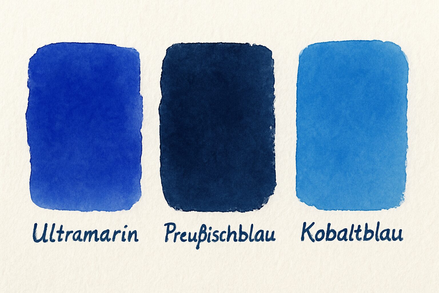
When cobalt blue came onto the market at the beginning of the 19th century (1802), painters had three qualitatively different but technically combinable shades of blue at their disposal for the first time.

Ultramarine, Prussian blue, Cobalt blue
Ultramarine was warm, velvety, with a slightly reddish undertone
Prussian blue was deep, dark, almost black-blue, with a greenish sheen.
Cobalt blue was neutral, cooler, clearer, airier, a pure, medium sky blue.
Until the 18th century, landscape painting was considered a ‘lower genre’ in the hierarchy of academic painting. History painting was at the top because it was considered intellectual. Landscape was an accessory, decorative but not meaningful.
That changed. In the late 17th and especially in the 18th century, landscape slowly developed from a background motif to a theme in its own right. Painting schools in Holland, Italy and England began to show nature not only as a backdrop for mythological scenes, but as a space for experience.
When cobalt blue became available, it encountered a generation of artists who already understood light, air and atmosphere as central motifs.
The need to paint nature thus preceded the availability of colours.
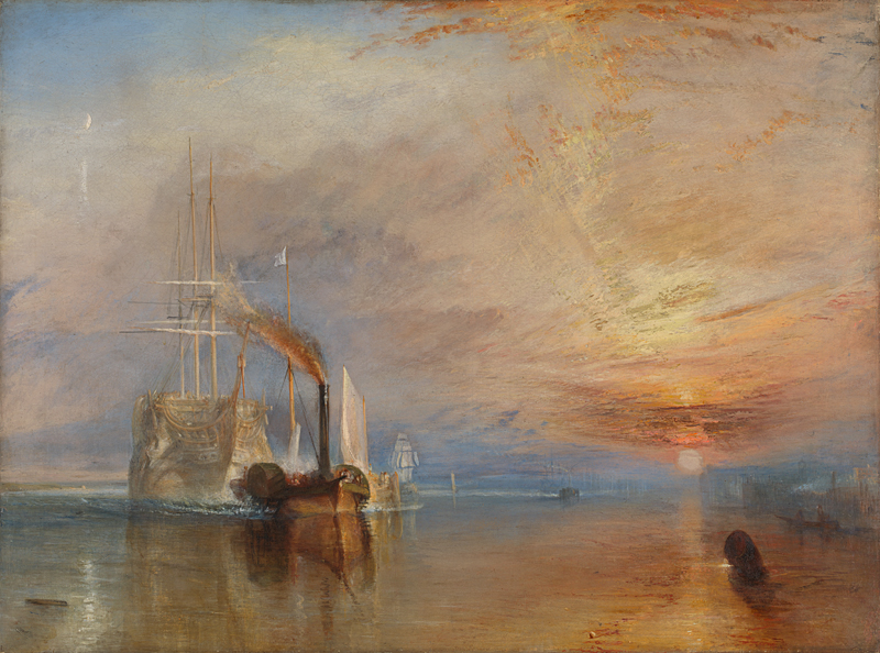
For the first time, cobalt blue had the optical character of daylight, a medium, neutral, slightly muted sky blue that could be lightened in glazes without turning grey. This was ideal for the new themes of sky, distance and aerial perspective.
The new colour reinforced the trend. Technique followed artistic interest, and artistic interest in turn followed the new possibilities offered by technique.

Joseph Mallord William Turner The Fighting Temeraire 1839, National Gallery, London
After cobalt blue, chemistry began to systematically address pigment production. The major European laboratories – in Paris, London, Munich – sought ways to produce natural colours synthetically and more cheaply.
The aim was to create pigments that were lightfast, opaque, inexpensive and chemically stable. The next big step was synthetic ultramarine, developed in France in 1828.
With the artificial variant, ultramarine was now affordable for everyone.
In the second half of the 19th century, new cobalt compounds were added, such as cerulean blue, a light, greenish-blue pigment (around 1860).
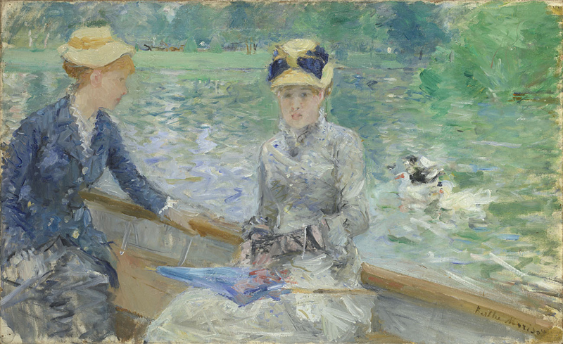
The clear, slightly greenish sky blue became particularly important for landscape and plein air painters. The Impressionists loved it because it could be used to paint atmospheric effects. Monet is said to have used cerulean specifically to capture the ‘cold freshness’ of light, a contrast to the warm tones of his sunsets.
Phthalocyanine blue (phthalo blue) was discovered in 1927 and has been on the market since the 1930s. It remains one of the standard pigments to this day. Phthalocyanine pigments are so colour-intensive that tiny amounts are sufficient. This makes them real workhorses in modern painting. Not only do they cover huge areas, they also remain stable for decades. Artists such as Pablo Picasso and David Hockney used it in their paintings.
The Colour Index International, the standard directory for pigments and dyes, currently lists around 170 shades of blue. In the modern artist's palette, however, only about 10–15 pigments play a constant role, mostly variants of cobalt, ultramarine, cerulean and phthalocyanine blue, plus a few special synthetic pigments.
These are used to create different shades through various recipes and mixing ratios. Some manufacturers offer 20–30 different shades of blue alone.

Berthe Morisot Summer's Day about 1879, National Gallery, London
One could say that the old pigments (lapis lazuli, azurite, Egyptian blue, Prussian blue, cobalt blue, synthetic ultramarine, cerulean blue, phthalo blue) form the ‘main line’.
Everything that came after that are branches or variations – new recipes, but no fundamentally new discoveries. The last truly new blue that caused a sensation among experts was YInMn Blue, discovered in 2009 at Oregon State University.
It is the first new inorganic blue in almost 200 years.
It was not until 2020 that the US Environmental Protection Agency (EPA) officially approved the pigment for use in artists' paints. It is also approved as a pigment for artists' paints in the EU. The colour tone is clear and very pure, with no green shift. Despite its high opacity, the blue has a brilliant glow. Some artists describe it as a kind of ‘modern cobalt blue’, only slightly richer and even more stable.
The pigment is extremely expensive, significantly more expensive than cobalt blue or synthetic ultramarine. Therefore, production volumes are low.
Some manufacturers such as Gamblin, Kremer Pigments, Daniel Smith and Golden have released small batches.
Incidentally, blue is the most frequently cited favourite colour in almost all global studies. This applies to Europe, the USA, large parts of Asia, Australia and many African countries.
The percentage varies depending on the study, but in most cases between 30% and 45% of respondents answer ‘blue’.
Join the newsletter now
and not miss a thing
Get exclusive insights into my creative processes, learn the stories behind my artwork
and receive invitations to my exhibitions and events.
To say thank you, I'll give you 10% off your first purchase.