


No products in the cart.
July 22, 2026
A holiday on the south coast of France smells, to me, of grilled fish. Howard Jones' album Human's Lib takes me straight back to Michael Ende's The Neverending Story, and warm summer rain feels like adventure and long holiday afternoons with my friends. Our memories are bound up with what we sense, inside and out.
They have the power to take us back — to another place, another time.
So when I read Susanne Heinen's call for a blog parade, I was immediately taken with it. The theme: the colour of my childhood.
And without a moment's thought, I knew exactly what colour it was: orange!
In Germany, the immediate post-war years were grey. Among rubble, shortages and ration cards, it was simply about getting by. Only slowly did life return to something like normal. Then came the economic miracle — first the fridge, then the car, then the first trip to Italy. Prosperity seeped gradually through every layer of society.
The colours, though, stayed soft. Pastels, mint green, pale pink, baby blue: a world of colour like a boiled sweet, well-behaved and tidy. It was the palette of a generation that was allowed to, but didn't yet dare. The daring came with that generation's children. In the late sixties, the young rose up — against their parents, against their silence about the past, against the narrowness of all that comfort.
"Make love, not war." The hippie movement painted itself in colour, because colour was the opposite of everything their parents' generation stood for — the opposite of uniforms, of grey, of order at any price. Colour was protest you could wear.
The blaze of colour that followed in the seventies was that movement's legacy. Orange, brown, mustard yellow, avocado green. The once-rebellious shades moved into respectable living rooms and became mainstream.
What began as an uprising ended up as wallpaper. The orange of the flower children landed on the sofas of perfectly ordinary families; psychedelic patterns brightened kitchens where revolution was never once discussed. The seventies took the wild colours of '68 and made them fit for the living room.
And they were the decade of my childhood.
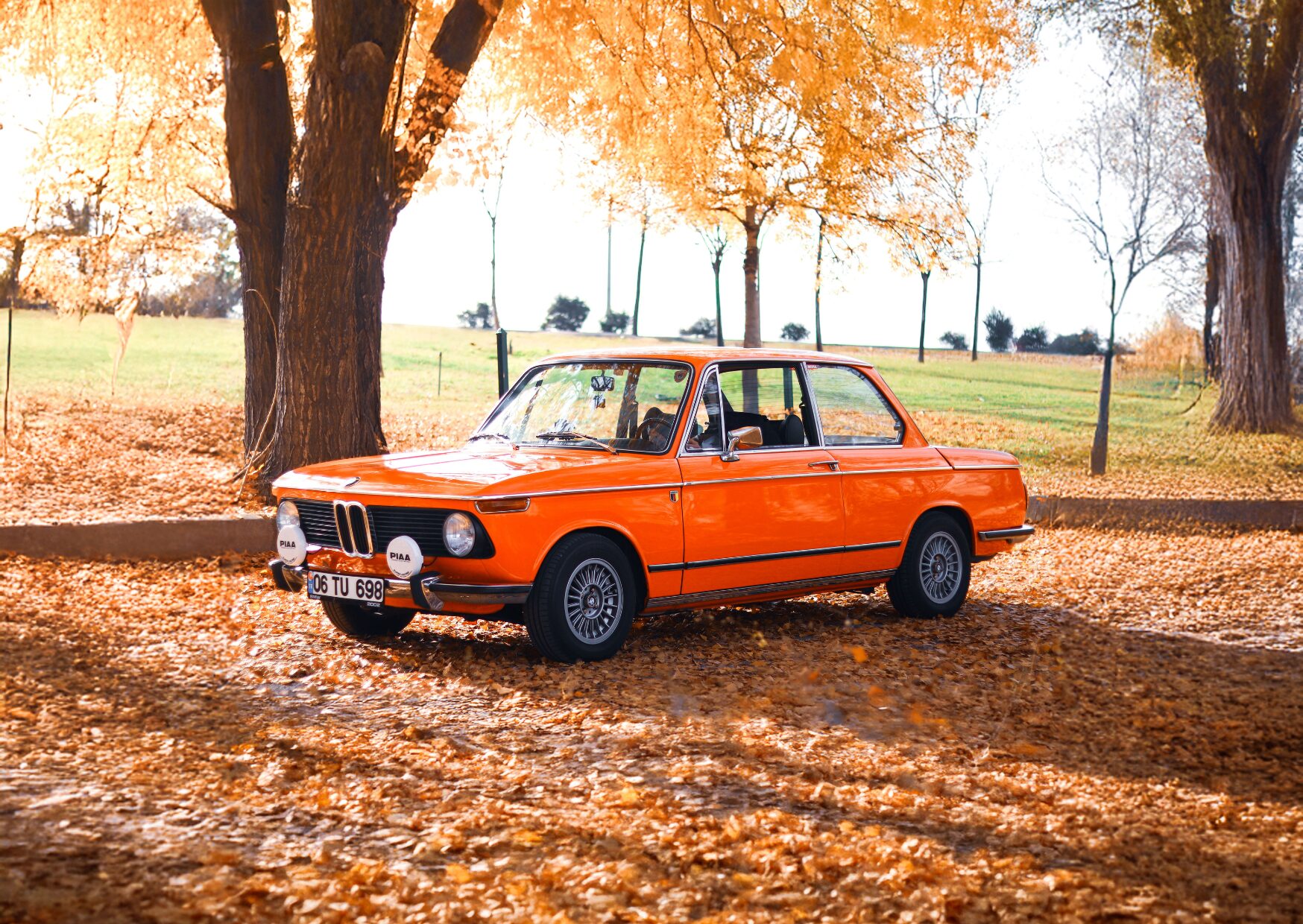
In the seventies, even the cars were orange.
Even though we didn't know it at the time, we belonged to Generation X. Many of our mothers went out to work. After school we let ourselves in, made ourselves a sandwich, and then the afternoon stretched ahead as one great, unsupervised promise. Onto the bike and off we went.
We played in the street, built dens on waste ground, roamed through woods and across fields. Grown-ups usually only had a rough idea of where we were.
If we felt like it, we simply rang the doorbell at a friend's house. Nobody messaged first, nobody rang ahead. You stood at the door and asked, "Can Miriam come out?" Or you stayed in and played there instead. That's how we came to know our friends' kitchens, and almost every one of them seemed to glow in warm shades of orange, green or yellow. For me, orange became the colour of everyday life and of feeling safe.
Our patch was the Ruhr. While the pits were closing and the region was changing, we played in the shadow of winding towers and chimneys. Even living, as I did, on the edge of the coalfield, that industrial landscape was never far away. At the same time, nature was beginning to reclaim its space. Old railway lines, waste ground and disused industrial sites became wild playgrounds.
Our own radius was often just a few streets, but behind every makeshift den and every field a new adventure was waiting.
And while the grown-ups built new houses and slowly changed the landscape, we children claimed those in-between spaces for ourselves, until they, too, disappeared.
Roadworks, high-vis jackets, bin lorries — orange is a warning colour. A colour that shouts for attention. And the orange of the seventies was anything but quiet.
It can tip over easily, too. Then energy becomes restlessness, and presence becomes something rather pushy.
But orange radiates warmth as well. It calls to mind sunlight, fire, the last golden hours of the day. It's a colour that creates closeness and makes rooms feel alive. It's a colour of movement and of change. Little wonder it became the colour of a generation that wanted to break open the old order.
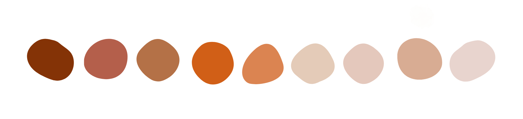
For me it doesn't just recall a bygone era, but a feeling: open doors, afternoons with no fixed plan, ringing a friend's doorbell, and the warm light of a kitchen where you were welcome.
Orange comes from red and yellow, and it inherits from both. From red, energy and strength; from yellow, brightness and light. But orange is never just orange. Add more red and the colour turns richer, more sensuous. With brown it becomes calmer, earthier. Grey takes a little of its glow away, and mixed with white, orange turns friendly, soft and approachable.
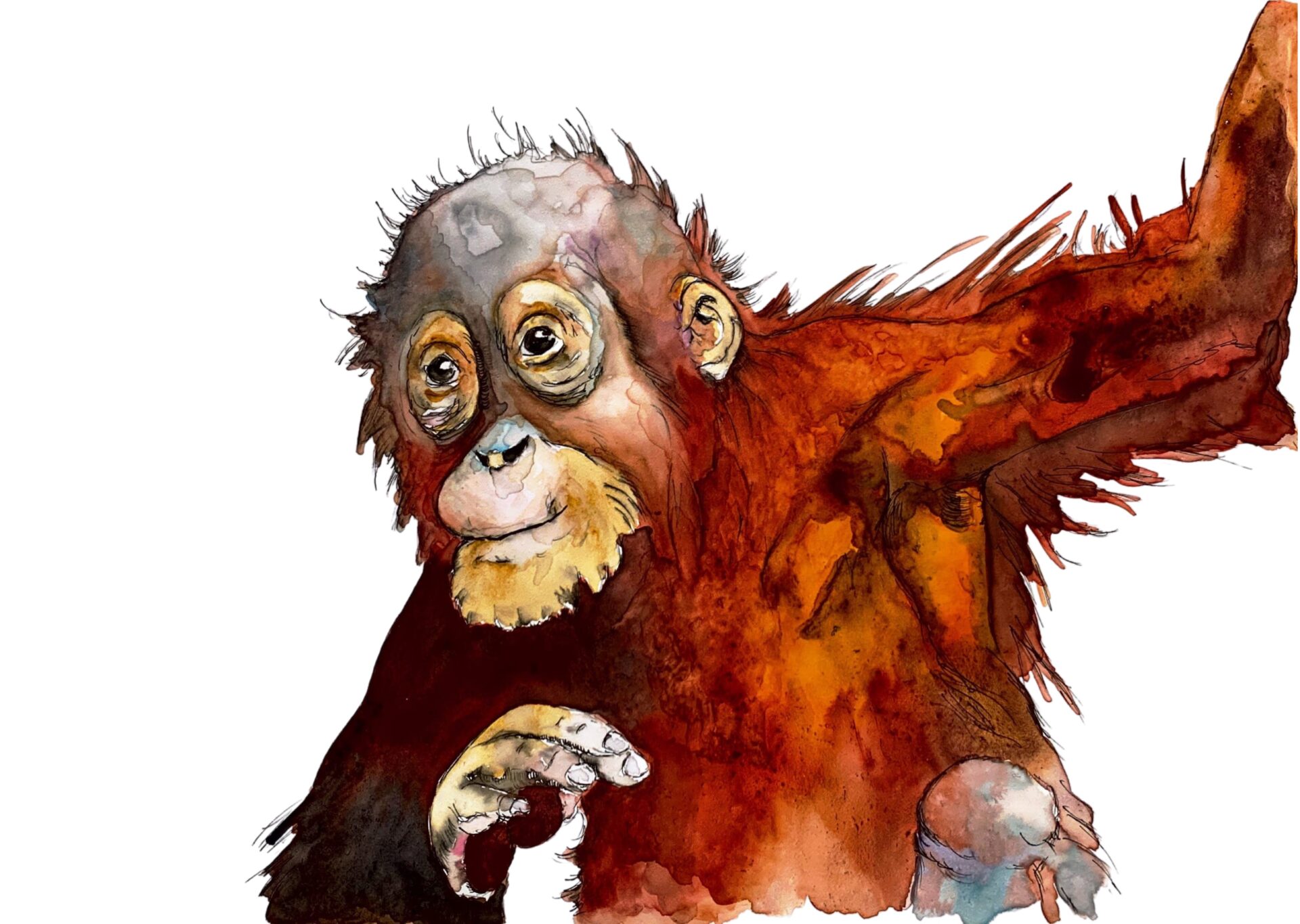
Young Orangutan, Lea Finke
It began with the earth. Long before synthetic pigments existed, people painted with whatever they found around them. Iron oxide, ochre, supplied warm yellows, reds and oranges. These are precisely the pigments found in cave paintings such as those at Lascaux and Altamira. That makes orange one of the oldest colours in the whole history of art.
In the Renaissance, a soft mixture of clay and iron oxide was pressed into red chalk. Artists such as Leonardo da Vinci, Michelangelo and Raphael used it for studies of hands, faces and the human body. Its warmth made it ideal for rendering skin tones, light and shadow. Many of these drawings still feel astonishingly alive today, precisely because the orange-red of the chalk carries a natural warmth. Titian, Veronese and Rubens worked extensively with orange tones too.
In the nineteenth century, orange moved further into the foreground.
William Turner steeped his late landscapes and seascapes in an almost supernatural light. Sunsets and fires in particular glow in golds, yellows and oranges. In Turner's hands, orange becomes light itself. It doesn't merely describe a landscape; it conveys atmosphere and emotion.
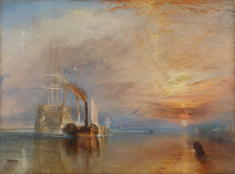
The Fighting Temeraire, William Turner, National Gallery, London
The spectacular sunsets Turner painted found a surprising real-world counterpart decades after his death. On 27 August 1883, the volcano Krakatoa erupted in one of the most violent eruptions of modern times. Vast quantities of ash and sulphur particles reached the stratosphere and spread across the globe. For months afterwards, twilights and sunsets glowed with unusual intensity in reds, violets and oranges.
It was a spectacle that fascinated artists, writers and scientists alike. William Ascroft, for one, documented the strange colours of those evening skies in numerous colour studies and pastel sketches.
Alfred Lord Tennyson noted, in a comment on his poem "St Telemachus", that the opening scene had been prompted by his memory of the Krakatoa eruption. He describes the evening sky as "blood-red" and speaks of a "wrathful sunset".
Robert Bridges took up those extraordinary skies as well, though to entirely different effect. In his verse epic "Eros and Psyche" (1885) he describes a sunset full of orange, gold, green, pink and violet: "Broad and low down … a wealth of orange-gold was thickly shed …"
Where Tennyson makes the sky seem menacing, Bridges celebrates its overwhelming beauty. Suddenly the very same shades of orange are telling an entirely different story.
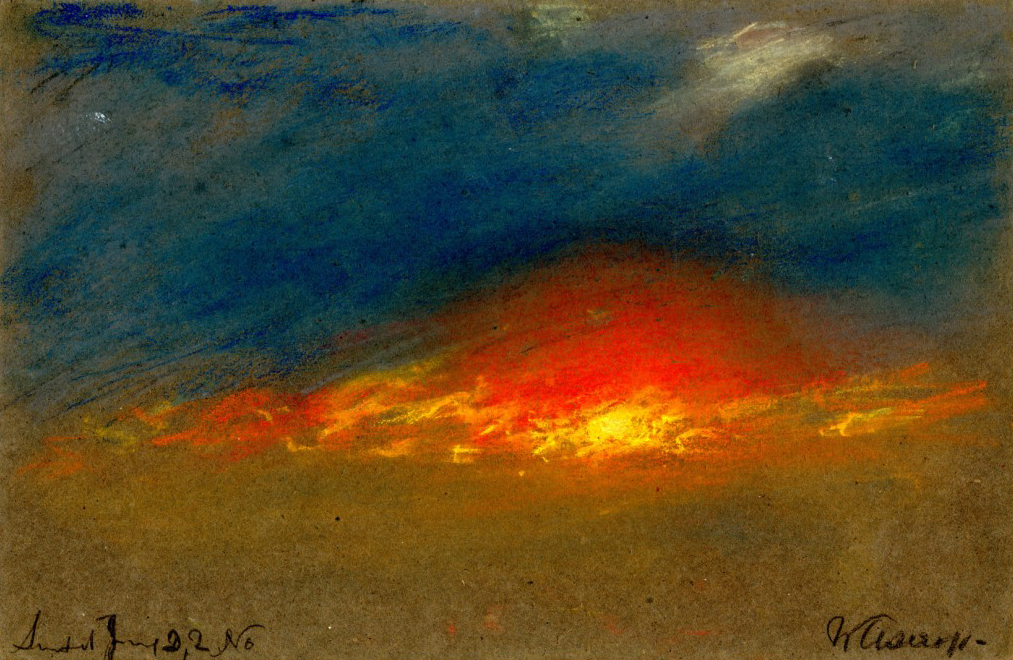
William Ascroft, Krakatoa
For Vincent van Gogh, colours were an expression of feeling. In "The Harvest" (the image at the top of this post) the fields blaze in strong orange and gold. That orange speaks not only of ripe corn and sunshine, but of warmth, abundance and the sheer force of summer. Van Gogh also liked to set orange against the blue of the sky. As complementary colours the two intensify one another — the orange begins to positively glow.
In the twentieth century, orange finally broke free of the representational. Artists like Mark Rothko made the colour itself the subject. In paintings such as "Orange and Yellow" there is no landscape and no figure anymore. The orange is no longer the colour of a field or a sunset — it is the experience itself.
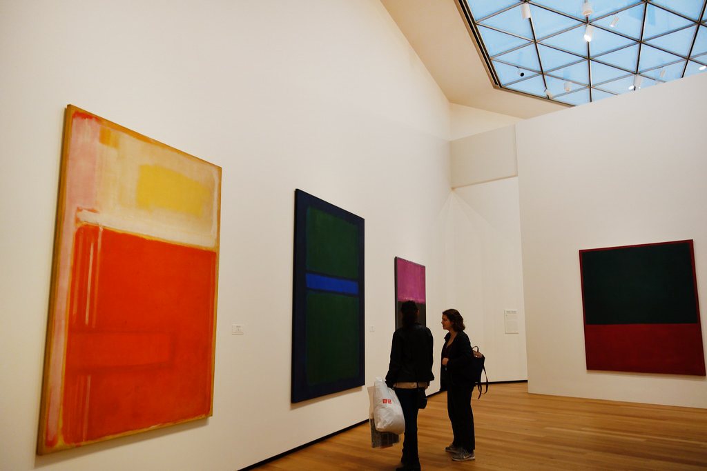
Mark Rothko, National Gallery of Art, Washington DC
The orange in my memory is probably warmer than it ever was in reality. Colours we remember are never just colours. They are steeped in afternoons, in voices calling our names, in doors that stood open.
That's true of my art as well. I'm not looking for an exact likeness, but for what remains once everything else has faded: the warmth, the crack, the trace.
And as I write this, I find myself back in so many scenes at once that I have to stop and catch my breath.
This wandering through memories has been a pleasure - and rather more than that. So my thanks go to Susanne for her blog parade. Do visit her site and read about other colours and other memories.
So, what's the colour of your childhood?
Join the newsletter now
and not miss a thing
Get exclusive insights into my creative processes, learn the stories behind my artwork
and receive invitations to my exhibitions and events.
To say thank you, I'll give you 10% off your first purchase.